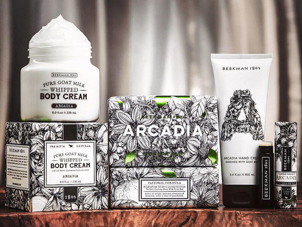
Beekman 1802
Product Packaging
Botanical Illustration | Typography | Branding

Beekman 1802 has a wonderful story, and the moment we connected to brainstorm the collection, I knew it would be a perfect fit.
THE BRIEF
Arcadia: A vision of pastoralism and harmony with nature, derived from the Greek province of the same name which dates to antiquity.
Scenes of walking through upstate NY in fall.
Fragrance Notes
Top: Orange, Muget
Middle: Clematis, Bois De Rose, Patchouli, Jasmine
Bottom: Musk, Sandalwood, Amber, Vanilla
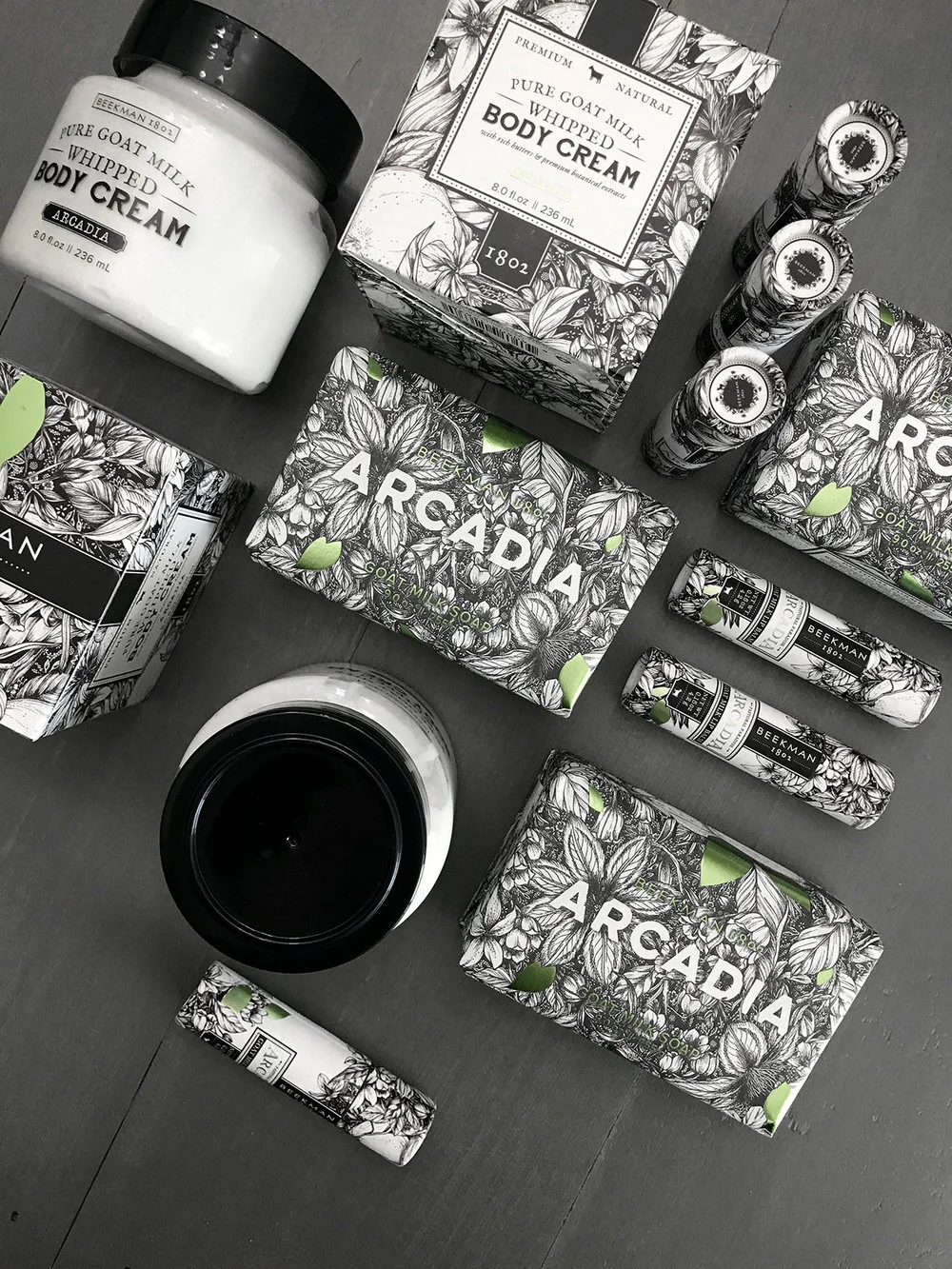
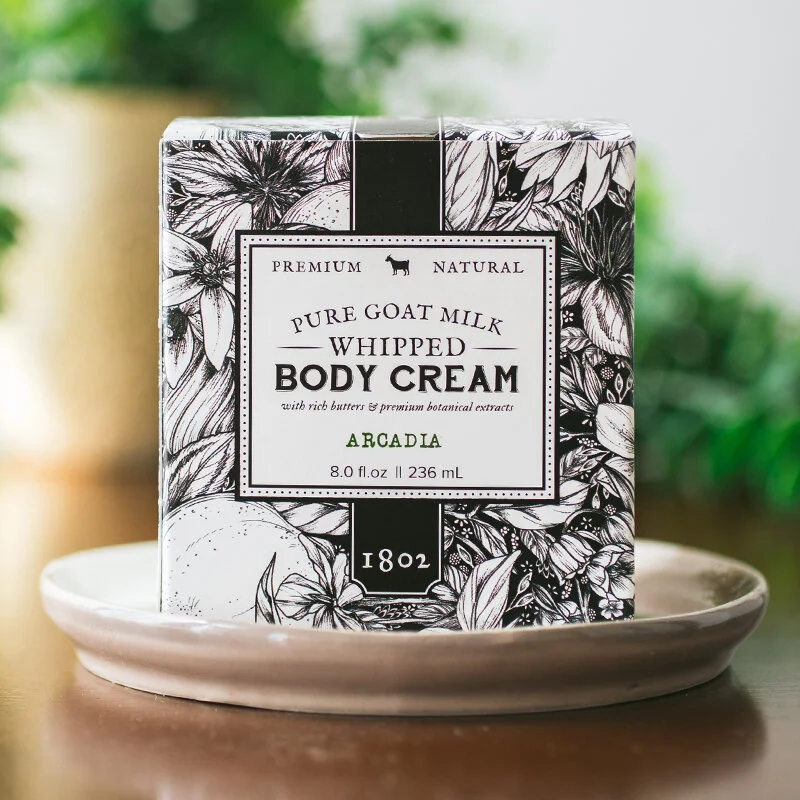
I am fortunate to work with consumer goods manufacturers that are as passionate about their work as I am about mine. Because of this, I want to honor the craft they have put into their products by creating interesting, beautiful packaging for them. In the case of Beekman 1802 products, my job was to make sure that each soap, lotion and gift box tells a story, sparks sensory notes, and accurately represents just how wonderful the products are.
You can shop the collection on HSN or shop.beekman1802.com
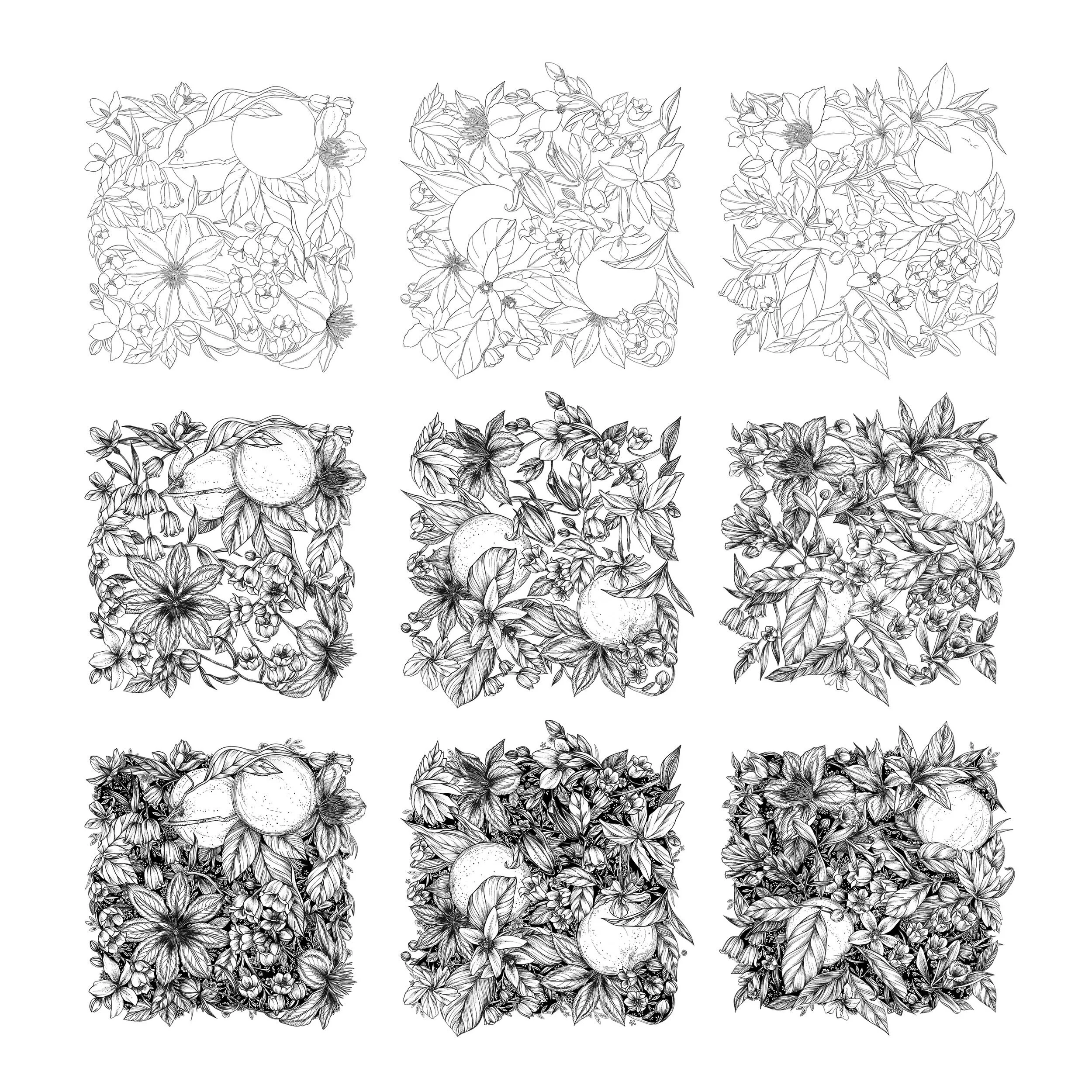
THE ARTWORK
I was commissioned to bring Arcadia to life.
My design process always begins with thorough plant research and sketches. The Arcadia collection had to span multiple products of varying sizes. My primary goal was to have the artwork scaled perfectly across the collection, keeping a consistent size and detail level across all products regardless of their size. My solution was to build three pattern tiles that could either be repeated to create an infinite pattern, or could be rotated and placed randomly to create entirely new compositions.
THE VECTOR ASSETS
A secondary illustration, the 'A' monogram for Arcadia, was illustrated and vectorized for use on products and in promotional applications.
See below for initial sketch, digital and vector icon.