


Philosophy
I’ve had the joy of illustrating four consecutive holiday campaigns for Philosophy. For each collection, I created a scent-note-driven visual language for Amazing Grace, Pure Grace and more, illustrating expressive botanicals that capture the essence of each fragrance. These illustrations were applied across the brand’s holiday collections, from delicate on-pack details to full campaign visuals.

Saigon Baigur
Saigon Baigur approached me to create a flexible, bespoke pattern that could be used across special-edition packaging as well as large-scale artwork within their distillery.
As a gin lover (you may have noticed?) I thought I’d seen and drawn it all when it came to gin botanicals. Saigon Baigur is a little different: it’s a premium dry gin from Ho Chi Minh City, Vietnam. In addition to many of the botanicals we commonly see in gins - juniper, coriander and angelica root - Saigon Baigur includes local Vietnamese botanicals, most of which I’d never drawn before. I was able to play around with such a rich selection: Buddha’s Hand, lotus flowers, Saigon cinnamon, Phu Quoc peppercorn, lemongrass and bird’s eye chili, among others.
Even more intriguing: I was asked to make a Vietnamese dragon front-and-center to the pattern design. This gave me the opportunity to dig into centuries-old illustrations, historical archives and learn so much more about the source material: it was an absolute honor to craft this artwork.
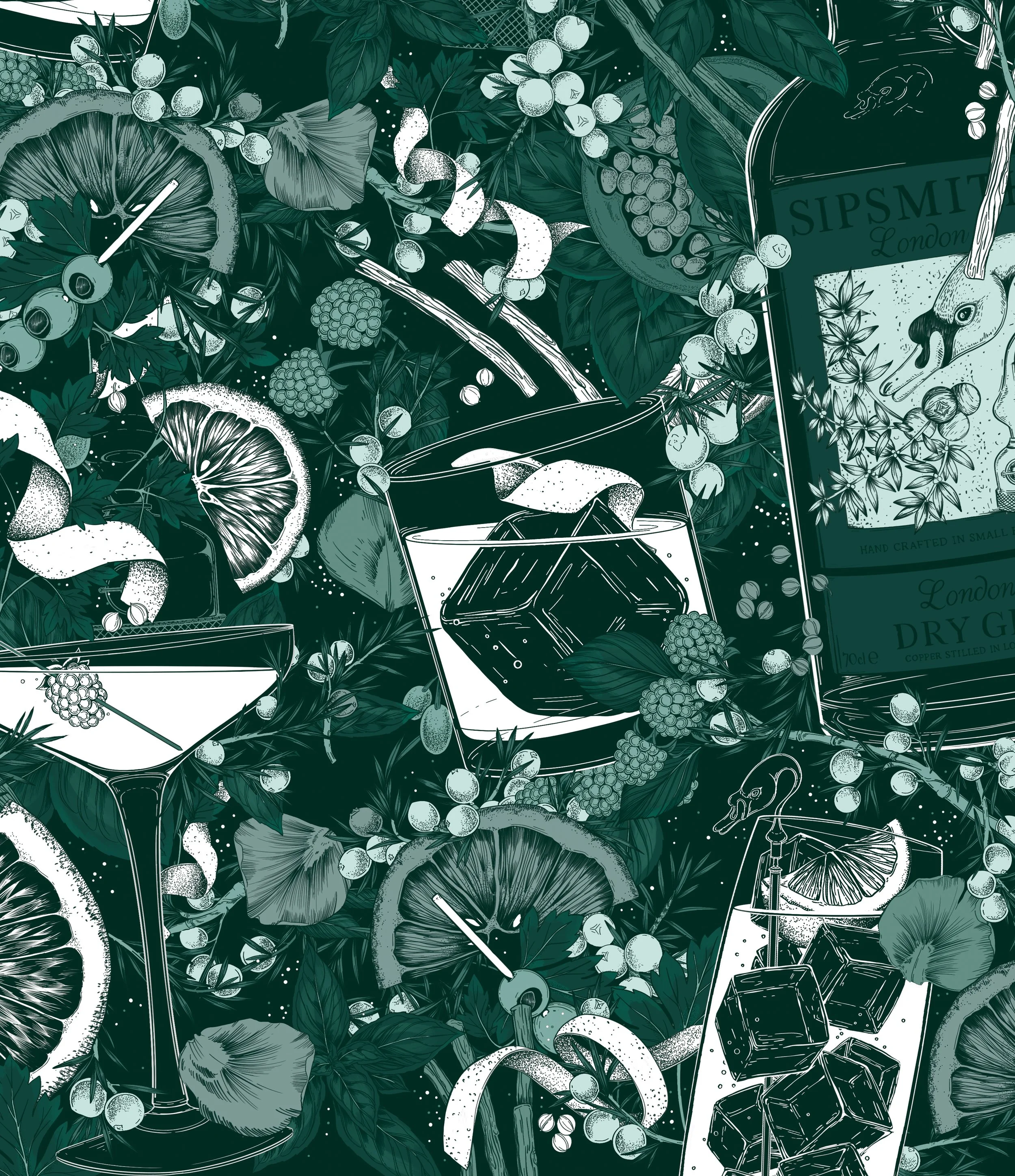
Sipsmith Cocktail Book
SIP: 100 Gin Cocktails by Sipsmith
Book Cover Illustration
I was asked to illustrate the cover and interior spot illustrations for a new book by Sipsmith. The book, titled SIP: 100 Gin Cocktails with Only 3 Ingredients is filled with recipes for simple, gorgeous cocktails that can be made at home.
I created a tonal pattern of gin botanicals, glassware and cocktails in Sipsmith’s signature green, utilizing inverse line + fill colors to highlight specific areas of the artwork. As a gin fan, this one was a dream.

Publix Ice Cream
For Publix’s newest flavor, Marry Me Strawberry, I was asked to illustrate a wrap-around pattern of berries and strawberry blossoms. We wanted the berries to read as super fresh while keeping a fairly limited, romantic palette. My goal was to make the pattern feel delightfully indulgent, and I loved leaning into the sweetness of the flavor and letting it guide the illustration.

Twilight Deluxe Collector’s Edition
For the 20th anniversary of Twilight, I was commissioned to completely reimagine one of the world’s most recognizable book covers as a vintage coming-of-age novel, the very genre that Bella Swan cherishes within the story. For the Deluxe Collector's Edition, Twilight is reinterpreted through her eyes: with passion and gothic tension informing the direction of my cover illustration.
Knowing the illustrative focus would be on botanicals, apple blossom flowers lent themselves perfectly to the brief - a nod to the original cover - but with a vintage twist. We chose a color palette that interpreted the apple’s symbolism anew: danger wrapped in beauty, light + dark, innocence + danger.

Nature Conservancy Magazine
For the last three years, I’ve had so much fun illustrating art-forward features for Nature Conservancy Magazine, each one pairing scientific storytelling with imaginative full-bleed illustrations.
My pieces include “Moonstruck,” illustrating how the lunar cycle affects plant and animal life; “Tidal Treasures,” a dense wallpaper of shells and sea creatures for a story on the science of shells; and “The Dark Ecology of Predatory Plants,” a vivid exploration of carnivorous species like Venus flytraps and pitcher plants. Across all three, I’m given the freedom to build fantastical scenes while staying rooted in real biology.

Los Angeles Times
As my second contribution to the publication, I was commissioned by the Los Angeles Times to create a dense, full-page cover illustration for The Weekend section.
The illustrations were designed to shocase a botanical exploration of LA-native botanicals alongside a service piece that recommends the best nurseries for shopping for native plants for your home garden.

Beekman 1802
I created several illustration sets for Beekman 1802, including packaging for individual products and for their much-loved holiday limited-edition collection.
Arcadia: I illustrated a flexible all-over pattern and spot illustrations created for Beekman 1802's Arcadia product range - described as a pastoral paradise with notes of sweet autumn clematis, jasmine and a hint of almond.

FAUXMO
My illustration work for Fauxmo’s new range of alcohol-free cocktails included the creation of four flavor variant patterns, one for each of their initial SKUs.
The artwork pulls from the mood of Parisian cafés and sun-drenched summer brunches.
Each SKU features its own set of delicate botanicals layered with bold vintage badging, creating a balance between elegance and energy that really lets the ingredients shine.
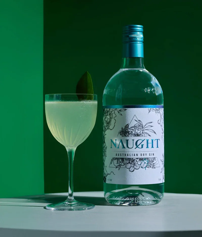
Naught Gin
Naught Gin
Label Artwork
Since early 2019, I've worked with Naught to develop bottle illustrations across their core and limited-edition offerings. The goal? A range of botanical-driven gins that cut through the Australian market with a darker, wicked aesthetic.
Both raster and vector assets were created for the full suite of Naught offerings, as the artwork needed to be scalable across product packaging, POS, web and on-site large-scale installations.

PrincessHay Installation
I was commissioned by to create nearly four hundred hand-illustrated botanicals and animals, which were were combined to create over 100 yards of storefront window displays. (Yes, the size of a football field!)
Located at the Princesshay shopping center, this behemoth of a mural is located in the heart of Exeter, UK: an attraction to tourists, locals and commuters. The mural was designed to put a spotlight on sustainability and inspire others to make small steps that make a positive difference to the future of our planet.